Although graphic and web designers have long recognized the importance of white space in user-centric design, most brands still struggle to accept the fact that less is more.
As a concept that first emerged in print media, white (or negative) space refers to any area of a page — physical or digital — intentionally left blank. In practice, this website element doesn’t have to be white — it can just as easily consist of solid colors or even background imagery. What matters is only that it’s strategically used to enhance overall user experience.
But what’s the practical value of incorporating white space into your online presence? Are the benefits of utilizing negative space simply aesthetic, especially considering that most web users prefer predictable and minimalist websites? Or can utilizing such an element also help your business communicate core brand messages?
The truth is, white space can do it all. So, if you’re ready to transform your pages from busy to bold, here’s how white space clarifies your brand message, supports engagement rates, and drives conversions. Let’s get into it.
Emphasizing Relevant Value Propositions
One of the biggest benefits of incorporating more negative space into your online presence is that it allows you to place emphasis on value propositions (or any other relevant brand message, for that matter).
The reason for this is simple. When the number of page elements is reduced on a website, visitors automatically pay more attention to what they see. Couple this with adequate visual emphasis (copy formatting, color, contrast, and placement), and you receive an outcome that can be exceptionally effective at grabbing and retaining your target audience’s attention.
But why does negative space work in this way?
There are two scientifically researched consumer behaviors that support the use of white space for the sake of accentuation:
- Web visitors form brand impressions within as little as 50 milliseconds upon landing on a website. So, if they don’t see something relevant to their wants and needs within the blink of an eye, they might decide that your brand and solutions simply aren’t the right fit for them.
- New studies suggest that consumers ignore irrelevant messaging. If your target audience doesn’t instantly recognize the relevance of your value propositions — which can easily happen with cluttered design — they’re more likely to move on from your website and seek solutions somewhere else.
Fortunately, white space can assist with both of these facets of web user behavior, making your core messages pop and resonate with their intended audience.
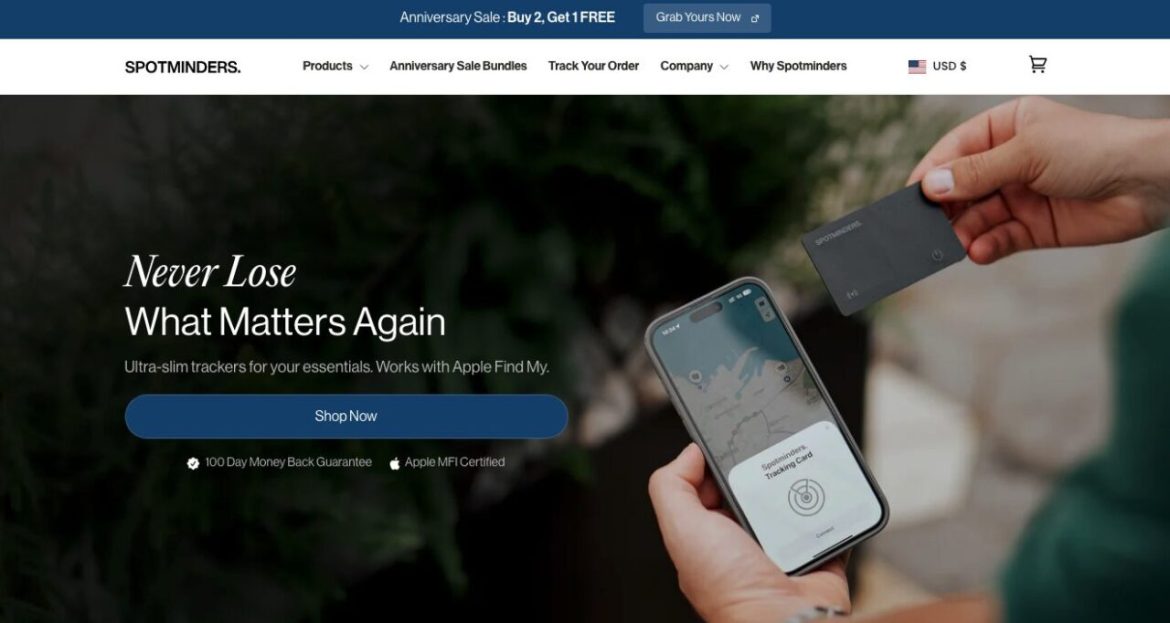
For example, the Spotminders homepage expertly uses negative space to emphasize its core value proposition: helping customers avoid the chance of losing their essentials ever again. What’s impressive about this brand’s use of white space is that its hero section contains a minimal number of elements — just a background image, a value proposition, two clarifying sentences, two trust signals, and a CTA button. Yet despite this pared-down approach, the benefit that Spotminders offers is exceptionally clear, demonstrating that minimalism genuinely does breed clarity.
Source: spotminders.com
Removing Buyer Uncertainty
One of the biggest factors stopping your target audience from converting into customers is buyer uncertainty.
If you look at the typical buyer’s journey, you’ll find that consumers are seeking answers at every step of the purchasing process.
They explore branded content to evaluate the effectiveness of potential solutions. They consult social proof to ensure they’re making smart decisions. Finally, they closely consider return policies to give themselves a fallback option in case they make the wrong choice for their needs.
However, while most buyers progress through all of these stages of the sales cycle, many buying journeys still end up unfinished. One of the main causes of this is analysis paralysis — a state in which consumers overthink a situation, causing them to entirely abandon the idea of making a decision due to a fear of making the wrong choice.
Obviously, if your business goals include growth and conversion optimization, removing all conversion obstacles and buyer uncertainty should be at the top of your list of priorities.
When designing digital resources to engage and convert customers, explore opportunities to optimize for clarity.
Tell your target audience precisely what they can (or shouldn’t) expect from your solutions. That way, you will effectively remove some of their doubts (and conversion obstacles) and gently guide them toward the lower stages of the sales funnel. To make your efforts even more successful, utilize white space to guarantee that these messages stand out to web visitors.
For instance, the GetSafe homepage does it beautifully by using negative space in a way that allows its primary differentiating factor to stand out. By minimizing the number of webpage elements in its hero section, GetSafe understands that web visitors genuinely notice (and comprehend) that its product is not another wearable medical alert system, winning over the audience segment looking for this specific type of solution.


Source: getsafe.com
Guiding Web Visitors’ Attention
If you compare a maximalist and minimalist website design, you’ll find that both aesthetic directions can have their own benefits. This is particularly true because the sheer number of web users (up to 6 billion people, according to some of the latest data) means that every single person will have a specific idea of what looks good.
However, the difference between a site filled with tons of design elements and one that intelligently utilizes white space is that the latter can be exceptionally effective at intentionally guiding visitors’ attention toward high-value conversion elements.
Ultimately, clutter screams for web visitors to look at it. And when there’s much of it, your prospects’ energy is wasted on interacting with elements that might not serve their intention of resolving their pain points.
Negative space, on the other hand, can be exceptionally effective at indicating where web visitors should look.
Elements that are surrounded by white space naturally stand out. Furthermore, some implementations of white space can even encourage web visitors to scroll, maximizing their engagement rates and their chances of recognizing a benefit that initiates their process of converting into customers.
So, if you’re curious about how you can use white space to create clarity on your website, consider taking inspiration from Joolies. This brand understands that it can’t fit all relevant product info into the hero section of its homepage. So, to encourage visitors to scroll, it incorporates a sliver of white space at the bottom of the first screenful (which is in perfect contrast with the colorful hero section), showing prospects that there’s more info below and indicating that they should scroll to find out more about the brand’s offer.


Source: joolies.com
Improving Readability and Accessibility
Product understanding is a crucial factor in determining consumers’ buying behavior. When shoppers have a high level of knowledge about a product (especially prior to entering the sales funnel), they’re obviously more likely to convert. But on top of that, research suggests that their buying journey may be shorter as well.
But here’s the thing. Elevating product understanding — particularly in niche markets — can be quite challenging. Yes, focusing on content readability and overall accessibility can help. Nevertheless, copywriting strategies are not always enough to drive positive results.
Fortunately, using white space in web design can be beneficial in terms of improving content readability and accessibility, thus positively influencing product understanding and boosting purchase intent as well.
Overall, there are a few ways negative space aids readability:
- Breaking up blocks of text with breathing room can reduce visual clutter, minimize cognitive load, and lead to an overall better user experience.
- Proper line spacing improves reading speed and elevates text comprehension by providing web visitors with natural pauses. They can use these pauses to process the information they’ve consumed thus far.
- Negative space can help optimize contrast between text and the background, further enhancing readability and accessibility.
What is more, when combined with additional comprehension-boosting visual elements (like images, illustrations, or data visualization), negative space can create a user-centric learning curve that gently guides web visitors through the product education process and maximizes their ability to recognize its relevance and value.
For example, the EXT Cabinets homepage expertly utilizes white space in this exact manner. In the How does the custom process work section of the website, this brand employs white space, numbers, and illustrations to logically guide prospects through the order process. This design approach invites web visitors to pause at each step and process the information before proceeding to learn about the next stage of the order process.
Source: extcabinets.com
Optimizing Conversion Paths
Last but not least, when it comes to the value of white space in clarifying your brand message, it’s worth noting that it’s an exceptional method to indicate to consumers precisely what they need to do next to move closer to resolving their pain points.
By surrounding high-value CTA buttons with sufficient negative space (and using other design strategies to ensure they don’t have to compete for attention), you can effectively encourage web visitors to move through your sales funnel while avoiding the possibility of them aimlessly scrolling through on-site content.
The value of this type of conversion path optimization isn’t just reflected in the fact that potential prospects understand what they need to do next to reap the benefits of becoming your customers. It’s also an exceptional method to shorten sales cycles, which are getting longer every year. In fact, with the average conversion now requiring eight touchpoints, something as simple as employing negative space for conversion optimization could be just what your business needs to unlock new growth opportunities.
So, what does this design strategy look like in real life? In truth, the only thing you need to do is determine which action you want web visitors to take next.
If you check out the California Real Estate Cost Segregation page from R.E. Cost Seg, you’ll see that the business expertly employs negative space and contrast to emphasize high-value CTAs (even compared to other potential customer actions). That’s precisely what allows the brand to guide web visitors to a conversion and improve its lead-generation efforts.


Source: recostseg.com
Final Thoughts
Incorporating more negative space into your online presence shouldn’t be difficult. Yet the benefits of this design strategy are exceptionally valuable — particularly if you’re aiming for a high-converting, user-friendly website.
The tactics discussed in this guide are an excellent first step toward clarifying your brand messages. For top-notch results, you’ll want to study the performance of your design decisions. That way, you won’t just uncover spaces where you need to adjust how you use negative space. You might also uncover core messages that your audience seems to respond well to, giving you the opportunity to highlight these and make them a more prominent element of your sales and marketing strategies.
PakarPBN
A Private Blog Network (PBN) is a collection of websites that are controlled by a single individual or organization and used primarily to build backlinks to a “money site” in order to influence its ranking in search engines such as Google. The core idea behind a PBN is based on the importance of backlinks in Google’s ranking algorithm. Since Google views backlinks as signals of authority and trust, some website owners attempt to artificially create these signals through a controlled network of sites.
In a typical PBN setup, the owner acquires expired or aged domains that already have existing authority, backlinks, and history. These domains are rebuilt with new content and hosted separately, often using different IP addresses, hosting providers, themes, and ownership details to make them appear unrelated. Within the content published on these sites, links are strategically placed that point to the main website the owner wants to rank higher. By doing this, the owner attempts to pass link equity (also known as “link juice”) from the PBN sites to the target website.
The purpose of a PBN is to give the impression that the target website is naturally earning links from multiple independent sources. If done effectively, this can temporarily improve keyword rankings, increase organic visibility, and drive more traffic from search results.